Jama7301 wrote:...I've been mulling something over in my head, and I can't seem to find a solution for it...
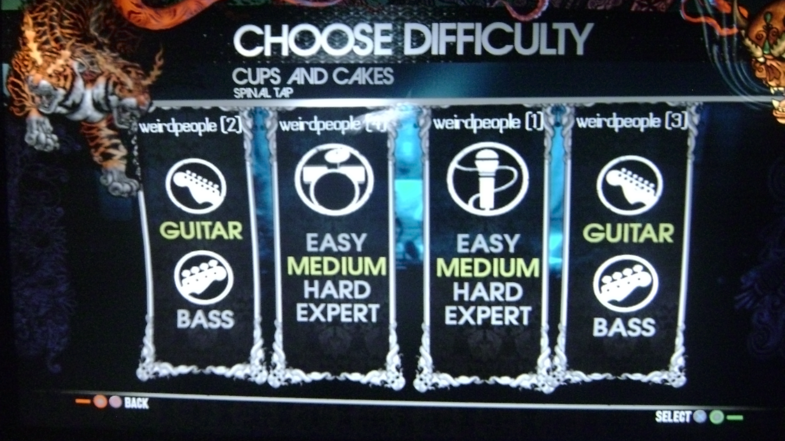
Is it just me or does the color scheme of the menus/score screen not mesh well with the scheme of the actual gameplay? Or is that just me?
That's a minor concern of mine, too...
I'm not sure about it though. We haven't actually settled on a scheme for either (though the menus are looking more and more likely to be close). I really like the purple flames and the layouts that Leapo has provided, but... I think I'm not sold on the black with the shine. I don't know why.
Apart from that, we
do have to find a way to apply that to the in-game stuff. I have a feeling that trying to apply the menu style to the game isn't going to be easy, and we may have to change stuff in the menus.
...but I'm rambling, and my thoughts aren't really cohesive at the moment.
Hopefully I'll get some time later in the day or tomorrow, and I shall attempt to collate some of the big ideas in this thread into the first (and second) post. Hopefully it will help me (and everyone else) see everything together and sort out what meshes, what doesn't, and what hasn't been considered yet.
EDIT
Second post updated with a list of ideas so far. Let me know if there are anly glaring omissions. Hopefully having all the ideas in (basically) one spot will help us keep track of the ideas so they don't get lost, and we can see about how they might fit together.
(being a moderator grants you the ability to double-post, but it's not always a good thing... I keep doing it by accident)