

ok here is my attempt at a "hotfix" lol i dont know if this works because i cannot test right now but if some one could try it out that would be great
Change log:
- Renamed 'TRY AGAIN' text in Failed Screen to 'RETRY SONG'
- Renamed 'GIVE UP' text in Failed Screen to 'NEW SONG'
- Renamed 'MAIN MENU' text in Failed Screen to 'QUIT'
- Changed menu order to be more like GH3
--Instead of RETRY SONG
NEW SONG
PRACTICE
QUIT
---now its RETRY SONG
PRACTICE
NEW SONG
QUIT
like i said i dont know if this will work but it is my first try so here you go
http://www.mediafire.com/?ixjhnfcny0g
Guitar Hero III Theme -=[For FoFiX]=-
Forum rules
- Read the rule stickies, especially ***** FORUM RULES • PLEASE READ BEFORE POSTING HERE! *****, before you post.
- If you are thinking about running from git, please do the entire community a favor and read this thread first. It contains some important information that anyone thinking about running from git should be familiar with.
This topic is 4 years and 8 months old. Instead of replying, please begin a new topic, or search for another related topic that may be more suitable.


worldrave i hope you dont mind, but i think your theme is the best one and its the one i use, but unfortunately im a bit of a perfectionist and i also want to help out in any way i can. in a few of your graphics, the elements have been resized badly, a way where full lines of pixels are just removed instead of the image being resampled. this leaves jaggy edges. i finally figured out how to extract the graphics from gh3pc and ive been messing with some things to try to make them as clean as possible.
this first one is all the same aspect as yours but the main frame around it is not resized at all, and the rest of the elements that did need resizing were done so by resampling, so its as sharp as they can be.

i think the loading pic youre using is a rip from a video, which is very very blocky, i like this one a lot more.

ive got a few more things on the go, i hope you can use these.
this first one is all the same aspect as yours but the main frame around it is not resized at all, and the rest of the elements that did need resizing were done so by resampling, so its as sharp as they can be.
i think the loading pic youre using is a rip from a video, which is very very blocky, i like this one a lot more.
ive got a few more things on the go, i hope you can use these.

evil-doer wrote:worldrave i hope you dont mind, but i think your theme is the best one and its the one i use, but unfortunately im a bit of a perfectionist and i also want to help out in any way i can. in a few of your graphics, the elements have been resized badly, a way where full lines of pixels are just removed instead of the image being resampled. this leaves jaggy edges. i finally figured out how to extract the graphics from gh3pc and ive been messing with some things to try to make them as clean as possible.
this first one is all the same aspect as yours but the main frame around it is not resized at all, and the rest of the elements that did need resizing were done so by resampling, so its as sharp as they can be.
i think the loading pic youre using is a rip from a video, which is very very blocky, i like this one a lot more.
ive got a few more things on the go, i hope you can use these.
I don't mind at all.
I would like to see some more samples you are talking about, but the one mentioned is actually not been resized a single pixel. There is some resizing done by FoF, but as much as possible, the majority of my graphics are all UNTOUCHED, and the only ones that are touched a little needed to be until more coding is changed to allow me to not have to touch it anymore in order to make it work. I choose not to resample, as i would rather use the images AS-IS, plus it creates image distortion in my opinion. This theme is always work in progress, and always improving. And a lot of the time i go back and either redo a previous graphic image once the code is changed to let me do that, or touch it up. I can literally give you an explanation for every little thing i have had to make a slight adjustment, and the reasoning behind it. But the majority of all the images are untouched. Other then the image workspace, but NOT the dimensions of the image itself.
Since you now also know how to rip the GH3, you will be able to see what i am talking about. Some just need to be changed temporarily until the code is changed to not have to change the graphics. But the stuff i am refering to is just a few items. And you'll also notice that after looking at all the pieces ripped from GH3, a good bit of them are sized on the fly by GH3 in game, since we don't have that capability in FOF yet, some graphics DO have to be manually sized to fit. (IE- The lower banner had to be scaled higher to fit the 4 lines of text, and also the top banner had to be sized bigger since the original was smaller and is scaled to fit by GH3.
That image is made of 20 different pieces of graphics-
1. Top Left border
2. Top Right border
3. Lower Left border
4. Lower Right border
5. Top Left White border
6. Top Right White border
7. Lower Left White border
8. Lower Right White border
9. Top Left White border Shadow drop.
10. Top Right White border Shadow drop.
11. Lower Left White border Shadow drop.
12. Lower Right White border Shadow drop.
13. Top Banner left side
14. Top Banner right side flipped
15. Lower top part of banner
16. Lower top part of banner (Flipped)
17. 'Song Failed' text added.
18. Bottom left banner graphic (to blend the image with white frame.)
19. Bottom right banner graphic (to blend the image with white frame.)
20. Grid behind main image.
That's just THAT image alone.
@Figure
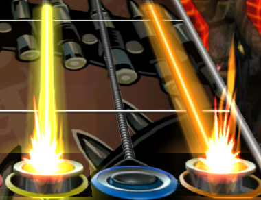
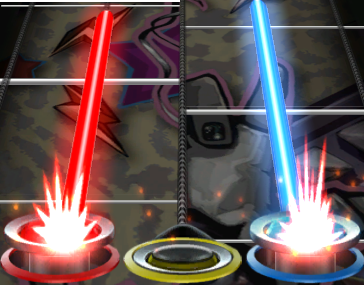
ok, did a little more with the tails. Close enough for now. I may come back to them, but there close enough for now til i can finish on other stuff 1st.
FOF GH3
---=Hotfix#7=---
+ Redid the streak meter frame.
++ Removed the shadow from left side and top from back when.
++ Put it back in now.
+ Touched up the score font again. (About done with that.)
+ Widened the meter needle 20% to match. (Was a LITTLE more narrow in width then it should've been.
+ Touched up the tail glows again
++ Adjusted the width wider again
++ Lessened the glow 10%. (Even GH3 wasn't exactly that bright itself.)
++ Softened the edge on the glow edge (was just a little bit too defined compared to GH3.)
Last edited by worldrave on Fri Sep 12, 2008 4:12 pm, edited 1 time in total.
FoF 1st Dual Meter.|.......FoFiX Site......|.. WR's GH3 Theme..|...WR'S GH5 Theme....|WR'S GH:A Theme

this is what im talking about. look how jagged and steppy your image is compared to the original graphic element ripped from the game. this is the bad resizing im talking about, and it drives me crazy.

i really hate to argue and i just want your theme to look as good as it can. but its pretty clear to me which looks better. and yes i did create my image the same way out of all of those elements.
edit-
to show in greater detail what im talking about. heres a gif showing how the resizing you are using is simply doubling every few lines of pixels instead of resampling. this is the worst method of resizing you can do and creates that jagged stepping effect. take a look, each of these lines is 2 pixels wide of exactly the same pixels.
Last edited by evil-doer on Fri Sep 12, 2008 5:17 pm, edited 1 time in total.
Yeah, i was going to edit my post after opening up my psd on that image. I did notice, after opening up that file again, that picture i DID have to reduce that image to fit the text properly, after seeing my 'IMAGE NON-REDUCED' folder i always keep, for any images i have to initially scale to fix around text until code fixes are applied, to allow me to redo those things as code allows me to. Sorry, and yes that image was one that was scaled. I agree with the differences. I was just thinking that was one i didn't rescale, until opening back up my psd and seeing it was. 
That's kind of what i mean sometimes about going back here and there and redoing things. Thanks for pointing that out. I'll go back and fix that one. Any other differences, let me know. I get so much going on at times, i might forget to go back and fix some things once code allows me to. And noticing things like this helps me out. Allows me to use this as also a sort of track record.
That's kind of what i mean sometimes about going back here and there and redoing things. Thanks for pointing that out. I'll go back and fix that one. Any other differences, let me know. I get so much going on at times, i might forget to go back and fix some things once code allows me to. And noticing things like this helps me out. Allows me to use this as also a sort of track record.
Last edited by worldrave on Fri Sep 12, 2008 5:27 pm, edited 1 time in total.
FoF 1st Dual Meter.|.......FoFiX Site......|.. WR's GH3 Theme..|...WR'S GH5 Theme....|WR'S GH:A Theme


worldrave: great, im glad you arent taking this as belittling your work or anything. im just as i say a bit of a perfectionist and notice stuff like this. the paused screen and i think some others have the same issue.
the new "you rock/failed" graphics look great, btw.
are you strongly opposed to anyone else submitting any graphics? i dont want or need credit or anything, i just like to help.
the new "you rock/failed" graphics look great, btw.
are you strongly opposed to anyone else submitting any graphics? i dont want or need credit or anything, i just like to help.
well, im kind of funny about my gh3 theme. i dont normally mind help, but i kind of prefer doing things solo when it comes to this, plus i love doing this and the more gets done, the more it takes away from things i have left to do, and might not stay around after this and possibly a gh4 mod. Thanks for the offer though. i just kind of do my own thing.
FoF 1st Dual Meter.|.......FoFiX Site......|.. WR's GH3 Theme..|...WR'S GH5 Theme....|WR'S GH:A Theme
worldrave wrote:well, im kind of funny about my gh3 theme. i dont normally mind help, but i kind of prefer doing things solo when it comes to this, plus i love doing this and the more gets done, the more it takes away from things i have left to do, and might not stay around after this and possibly a gh4 mod. Thanks for the offer though. i just kind of do my own thing.
fair enough, but im gonna bug you every time i see stuff like that ok? :p
what software do you use? ive been using photoshop for something like 10 years now so im pretty familiar with it. the only point i want to make about doing stuff like this is: never ever size something bigger if you dont have to. try to keep all the graphic bits the original size or scaling them down if you really need to. let the game size the things bigger. and for resizing always use bicubic resampling, never ever use "nearest neighbor", which does the whole line adding or subtracting.
evil-doer wrote:worldrave wrote:well, im kind of funny about my gh3 theme. i dont normally mind help, but i kind of prefer doing things solo when it comes to this, plus i love doing this and the more gets done, the more it takes away from things i have left to do, and might not stay around after this and possibly a gh4 mod. Thanks for the offer though. i just kind of do my own thing.
fair enough, but im gonna bug you every time i see stuff like that ok? :p
what software do you use? ive been using photoshop for something like 10 years now so im pretty familiar with it. the only point i want to make about doing stuff like this is: never ever size something bigger if you dont have to. try to keep all the graphic bits the original size or scaling them down if you really need to. let the game size the things bigger. and for resizing always use bicubic resampling, never ever use "nearest neighbor", which does the whole line adding or subtracting.
Finally back home again after 4 days of being at a friend's house with no net connection other then my bluetooth adapter that only supports XP, just my luck.
@Evil-Doer
I use PS3 now and used photoshop since Paint Shop Pro was still considered freeeware and layers didn't exist yet. Seriously, Be my guest about letting me know when you see stuff i missed.
This is always been fun for me, as a hobby in between other projects and work of course. Originally, a lot of the images had to be resized since they used hardcoded sizes and didn't have a choice, then slowly UC and Alarian started opening up a lot of doors for me to go back and redo them the right way, and then MFH, Evilynux, and Blazingamer since then non-stop mostly. Big thanks to them for allowing me to get ever closer then before.
Like I said, i HATE having to resize images unless i don't currently have a choice, and i totally agree about using bicubic resampliing, i'm not sure what happened to that image as far as the nearest neighbor method being used (maybe tired that night.), but keep in touch and don't be a stranger. L8er buddy.
FoF 1st Dual Meter.|.......FoFiX Site......|.. WR's GH3 Theme..|...WR'S GH5 Theme....|WR'S GH:A Theme
Rocker/Modder
-
Cleanmonk

- Member
- Posts: 376
- Joined: May 31st, 2008
- Location: St.Louis, Missouri
- Reputation: 0
- Contact:
the thing i would like (don't have to do) to be done is ...
-and then fail screen font (try again, quit etc..) should be closer and bigger and have those little curve things around the lighted word.
-and could you please remove the ">" on "option >" in the pause menu
-and the rock meter about 4% smaller.
-make the song font (*song*by*artist*,*year*) smaller and have the right colors.
-the score font need to be a darker shade of green and needs to have a darker green where the place aren't lit up so its more a digital clock look.
Last edited by Cleanmonk on Sat Sep 13, 2008 11:13 pm, edited 1 time in total.

this mod looks great! would anyone mind porting it over to mac?
See my star wars mod for Alarian!:
Star Wars Mod
Star Wars Mod
el nini wrote:Split screen? TWO keyboards on ONE compter? Madness I say. Madness...
New GH3 Hotfix Released
============
Newest GH3 Hotfix Here
============
--=Hotfix#8=--
+ New sharp and detailed Main Text graphics. (No more blurries)
++ Remade the main text from scratch using the GH3 main font i made (Since it's far enough done to use now.)
++ Added the dirt marks over the characters, since GH3 uses graphic fonts instead of ttf fonts.
+ Redid Pause screen using unscaled GH3 images
+ Remade the Failed screen using unscaled GH3 images.
+ Modified the editor screen
++ Lowered the brightness down 4% (Gives a closer SLIGHT more of an orange tint like the GH3 equivelant. Used screenshot to compare.)
++ Remade the buttons
+++ Matching the transparency
+++ Used the proper GH3 main font
+++ Matched the size of buttons
++ Lower banner of screen is scaled to be able to fix all the text, once space between text items is changed, i'll go back and change this back.
+ Tweaked yet MORE on the GH3 Main font. (just needed a little more TLC with the spacing edges of the characters.)
+ Redid the buttons on the Main screen, using the proper GH3 main font i made.
+ Redid the Preview button using the proper GH3 Main font i made.
+ Redid the Loading screen.
+ Touched up the Song Selection screen
++ Blurred 'Setlist' just a little to better match GH3
++ Redid the buttons from scratch
+++ Matched proper alignment. (Can't do the proper height since the selected line is drawn over the background and looks weird.)
+++ Matched proper size of buttons.
FoF 1st Dual Meter.|.......FoFiX Site......|.. WR's GH3 Theme..|...WR'S GH5 Theme....|WR'S GH:A Theme
Who is online
Users browsing this forum: No registered users and 21 guests